By Susanna Sigler, Library Assistant
Happy spring, Beehive readers! Taking a departure from my usual blog posts spotlighting WWII-focused materials, I wanted to focus on a fun item that’s been on my mind for a while now.
Over the summer, a researcher put in a request for a 19th-century book of typefaces. I took a peek at the book before the researcher examined it, and was delighted by its contents.
Called Rand & Avery’s Specimens, this book was published by Rand, Avery & Company, a book- and map-printing company in Boston in the mid- to late-19th century.
The book is exactly what a good business owner back then would have for their customers: a collection of specimens, or samples, of the different typefaces that the customers could order for their printing.
(Prior to writing this post, I did not know the difference between a typeface and a font. According to the Oxford Learner’s Dictionaries, a typeface is a set of letters, numbers, etc. of a particular design, for example Times New Roman, while a font is the particular size and style of a set of letters, for example Times New Roman italic, size 12).
What drew me to this book was not only the artistry of the typefaces themselves, but the sense of humor displayed in the sample text. You can guess just from the fake names the speciality of most of these businesses – “Jackplane & Broadaxe” (a carpentry firm), “Quadrant & Logline” (navigators), “Hopp & Ginger” (brewers), “Rains and Sunshine” (gardeners), and “Professor Lightheel” (a dancing instructor), to name a few.
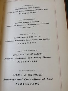
For some of the larger typefaces, there is less space to work with, and oftentimes the placeholder text is just nonsense phrases. Some veer into the poetic, while others often struck me as humorous (if you’re like me and find random words set in very large fonts amusing).
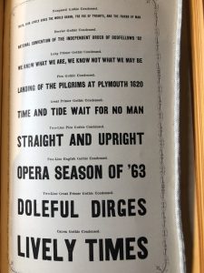
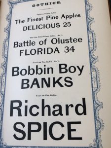
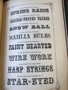
Aside from the textual content, the actual typefaces themselves are beautiful, ranging from simple and elegant to detailed and intricate. Some are ones that are still in use today, but many are not. Oftentimes the sample text will correspond to the qualities of the font itself–there’s a special typeface in the shape of snowballs, for example, and one proclaiming “tulip beds” that looks to be itself blooming.
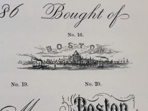
In addition to the typefaces, there are also small drawn icons and other logos that can be incorporated into a customer’s design. My personal favorite is this one of Boston, with tiny ships.
I’m not a pessimist, or someone who thinks that creativity and beauty in graphic design is long gone, but styles in the mainstream nowadays all seem to have a similar corporate look. Minimalism has rendered interiors completely boring at best, and terrifying alien spaceship at worst. I think they could take a page from Rand & Avery, and try to have a little more fun.
The Geo. C. Rand & Avery typeface book can be viewed at the MHS. The MHS also holds additional materials on typefaces and printing specimens, found under the subjects “Type and type-founding” and “Printing – Specimens” in ABIGAIL.
Sources
“Font.” Oxford Learner’s Dictionaries. Accessed March 21, 2023. https://www.oxfordlearnersdictionaries.com/us/definition/english/font.
Rand & Avery, Rand & Avery’s Specimens (Boston: Geo. C. Rand & Avery, 1860).
“Typeface.” Oxford Learner’s Dictionaries. Accessed March 21, 2023. https://www.oxfordlearnersdictionaries.com/us/definition/english/typeface.

